Waterfall islands are one of those things that look simple in photos. Just a slab of stone that drops down the sides of the island. Clean. Modern. A little dramatic.
And then you see one in real life and think, wow… this looks like a million bucks.
Or, the opposite.
Sometimes a waterfall island somehow makes the whole kitchen feel cheaper. Like a shiny showroom trick. Or like someone tried to copy a high end look but missed the details that actually matter.
So this is basically a guide to that. When waterfall islands look expensive, when they look cheap, and what to do if you want one that actually fits a Naples kitchen without feeling forced.
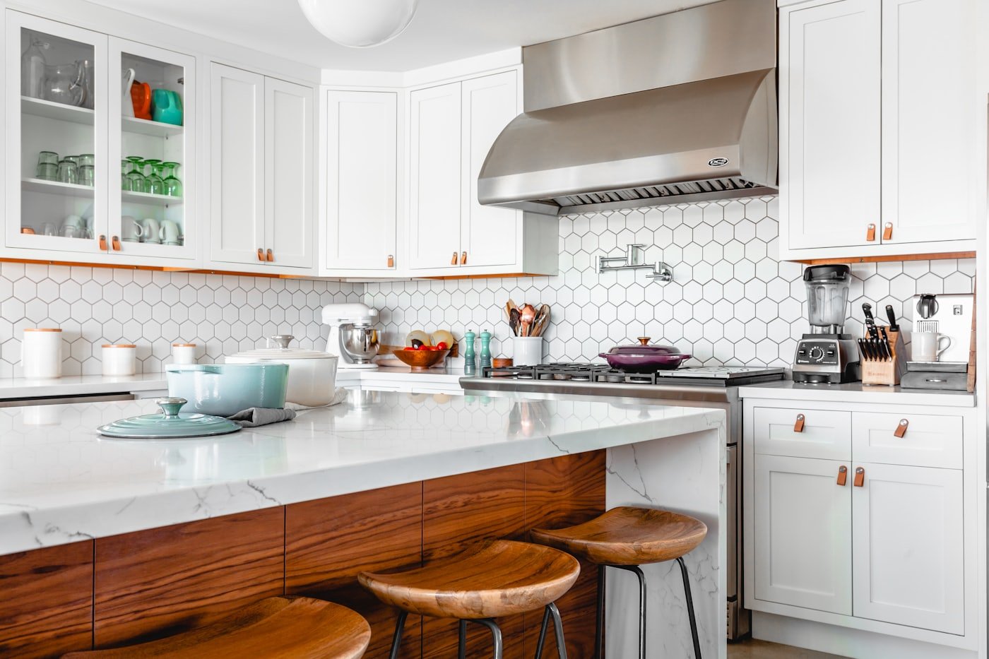
First, what a waterfall island actually is
A waterfall edge means the countertop continues vertically down one or both sides of the island, usually all the way to the floor. Instead of the countertop just ending with an overhang, it wraps the edge.
That wrap can be:
- One side only (common when the other side faces cabinets or a walkway)
- Both sides (the full waterfall look)
- Mitered edges (where the corner looks like one thick slab, not two pieces meeting)
The expensive looking ones are usually the ones where you cannot tell how it’s built. The corners look crisp. The veining lines up. The thickness looks intentional.
The cheap looking ones are the ones where you can see the seams, the pattern stops abruptly, the edges look bulky, or the whole island feels like it’s wearing armor.
When waterfall islands look expensive
1. The material choice makes sense for the room
This is the big one. In a high end kitchen, the countertop material feels like it belongs.
What usually reads expensive:
- Quartzite with natural movement, especially when bookmatched or carefully laid out
- Honed finishes (not always, but often) because they feel less showroom glossy
- Porcelain slabs with realistic stone patterns, used in a clean, minimal way
- High quality quartz with subtle patterning, not loud, busy speckles
What often reads cheap:
- Low detail quartz with repetitive patterning that screams “printed”
- High gloss everything, especially if the rest of the kitchen is also shiny
- Dark granite with heavy, dated movement paired with modern slab doors. It clashes
There is nothing wrong with quartz. Or granite. It’s just that the waterfall edge puts the material front and center. You are basically framing it like art. If it looks like a builder grade top, the waterfall makes that more obvious.
2. The veining continues through the corners
If you want the “wow” factor, this is where it usually lives.
On stone look materials, the pattern should wrap down the side so it feels continuous. That takes planning and fabrication skill. If the veining just ends and restarts on the vertical piece, it looks like two separate panels. Your eye catches it immediately.
A mitered edge with aligned veining is one of those quiet luxury details. People might not know why it looks good, but they feel it.
3. The island size and proportions are right
This one is awkward to talk about because it’s not a material issue. It’s a design issue.
Waterfall edges add visual weight. If the island is too small, a waterfall can make it feel even smaller and heavier. Like a block.
Expensive feeling islands usually have:
- Enough length that the waterfall reads intentional
- Enough clearance around them so the shape is clean
- Seating space that does not look squeezed in as an afterthought
In Naples, a lot of homes have open layouts, big sightlines, and strong natural light. That helps. But it also means a waterfall island is going to be seen from everywhere. If the island is undersized or oddly placed, you notice.
4. The waterfall is paired with simple, clean cabinetry
This is why you see waterfall islands in modern kitchens. It works best when the rest of the kitchen is not fighting for attention.
If your cabinets have heavy raised panels, ornate corbels, multiple layers of molding, and then you add a sleek waterfall island. It can look like two kitchens collided.
That does not mean you cannot do it. It just means the details need a mediator. Maybe the island cabinetry is simpler than the perimeter. Maybe the hardware ties it together. Maybe the countertop choice is softer.
5. The lighting hits it in a flattering way
A waterfall edge is a vertical surface. It catches light differently than a flat countertop.
If you have harsh overhead lighting, the waterfall side can highlight seams, uneven finishes, or dull patterning. If you have warm, layered lighting, it can make the stone look deep and natural.
If you are remodeling, treat island lighting like a design element, not just “pick two pendants and call it done.”
When waterfall islands look cheap (and it’s not always the stone)
1. The seams are obvious
Most waterfall edges are not a single piece of stone folded down. They are fabricated from separate pieces, joined at the corner.
If the joint is wide, messy, misaligned, or discolored, it kills the whole look. Because again. You are framing the edge. It’s the focal point.
Things that make seams stand out:
- Poor miter cuts
- Wrong adhesive color
- Pattern mismatch
- Chips or over polishing at the corner
A good fabricator can make this nearly disappear. A rushed job cannot.
2. The countertop thickness looks weird
Some waterfall islands look cheap because the thickness is wrong for the scale.
If you use a standard 2 cm or 3 cm slab with no miter and just drop it down, sometimes the edge looks thin and unfinished.
If you overcompensate and do a thick miter that is too chunky, it can look like a cartoon version of luxury.
There is a sweet spot. It depends on the kitchen style, cabinet thickness, and the island size.
3. The waterfall is used as a band aid for a design problem
I see this a lot in photos. People add a waterfall because they want a wow feature, but the rest of the kitchen is not designed around it.
If the island is too close to the fridge, too close to the range, or jammed into a narrow walkway, the waterfall edge becomes the thing you bump into. It starts feeling like a mistake, not a feature.
Sometimes the “expensive” choice is skipping the waterfall and investing in:
- Better cabinetry
- Better storage layout
- A better hood
- Better lighting
- A more cohesive backsplash
4. It highlights the wrong things
A waterfall edge can expose awkward cabinet ends, uneven floors, or poor toe kick planning.
If the floor is out of level and the waterfall hits the ground weirdly, you will see it.
If the toe kick detail is sloppy, you will see it.
If the island paneling is not flush and clean, you will see it.
Waterfall edges do not hide problems. They frame them.
The Naples factor: why waterfall islands are tricky here
Naples kitchens often sit in bright, airy spaces. Lots of white. Lots of natural light. Lots of open plan sightlines. And plenty of homes that lean coastal or transitional.
A waterfall island can look incredible in that setting, but you want to think about these specific things:
- Glare: Polished quartz and glossy porcelain can reflect like crazy in strong sun.
- Sand and wear: Honed finishes can be more forgiving for fingerprints, but they can also show etching depending on the stone.
- Style mismatch: Coastal kitchens often rely on softer textures, light woods, and warm whites. A stark waterfall slab can feel too sharp unless it’s balanced.
This is where design guidance matters. Not just picking a pretty slab.
A few waterfall island combos that usually look “high end” (without trying too hard)
Option A: Light quartzite + simple cabinets
This is the classic expensive look. The stone does the talking, the cabinets stay calm.
Option B: Porcelain waterfall + matching full height backsplash
Porcelain can look extremely clean and modern. But the key is restraint. If the pattern is loud, the whole kitchen can start feeling busy fast.
Option C: Waterfall on one side only
This is underrated. You still get the drama, but you do not overdo it. And sometimes it looks more tailored.
Option D: Waterfall with a furniture style island base
Yes, you can mix. A waterfall edge on a slightly furniture inspired island base can work if the colors and proportions are right. It can feel custom, not cookie cutter.
Practical tips before you commit
- Ask to see real fabrication photos from your fabricator. Not just slab pictures.
- Talk about seam placement early.
- Decide on finish based on your lighting. Take samples home, look at them morning and late afternoon.
- If you have kids or you entertain a lot, consider rounding or easing the corner slightly. Sharp waterfall corners look amazing and bruise thighs like it’s their job.
So… should you do a waterfall island?
If you love the look and your kitchen layout supports it, yes. A waterfall island can be one of the best visual anchors in a remodel.
But if you are doing it because you feel like you “should,” pause. The best kitchens do not follow trends. They follow good decisions. And a waterfall edge is one of those features that demands good decisions.
If you’re planning a kitchen remodel in Naples and want a waterfall island that looks truly intentional, this is the kind of detail a design build team can help you dial in early, before the cabinets are ordered and before the slab is cut. You can check out Kitchen Remodeling Naples FL by Cutting Edge here: https://kitchen-remodeling-naples-fl.com/ and request a consultation if you want someone to sanity check the layout, materials, and the whole waterfall plan.
Because once it’s installed, it’s not a small tweak. It’s the centerpiece.
FAQs (Frequently Asked Questions)
What exactly is a waterfall island in kitchen design?
A waterfall island features a countertop that extends vertically down one or both sides of the island, usually all the way to the floor. Instead of ending with an overhang, the countertop wraps the edge, creating a sleek and modern look. This wrap can be on one side only, both sides for a full waterfall effect, or include mitered edges where corners appear as one thick slab.
When do waterfall islands look expensive versus cheap?
Waterfall islands look expensive when the material choice suits the room, veining continues seamlessly through corners, the island’s size and proportions are balanced, it’s paired with simple cabinetry, and lighting flatters the vertical surfaces. Conversely, they look cheap when seams are obvious, materials have repetitive or printed patterns, finishes are overly glossy or bulky, or when design elements clash or feel forced.
Which countertop materials make waterfall islands appear high-end?
Materials that often read as expensive include quartzite with natural movement (especially bookmatched), honed finishes that avoid showroom glossiness, porcelain slabs with realistic stone patterns used minimally, and high-quality quartz with subtle patterning rather than loud speckles. These choices frame the waterfall edge like art and contribute to a luxurious feel.
Why is seamless veining important in waterfall island design?
Seamless veining where patterns continue through mitered corners creates a ‘wow’ factor by making the waterfall edge appear as one continuous slab. This requires careful planning and fabrication skill. If veining stops abruptly or restarts on vertical pieces, it looks like separate panels joined together, which disrupts visual flow and diminishes perceived quality.
How do size and placement affect the appearance of a waterfall island?
Waterfall edges add visual weight; thus, if an island is too small or oddly placed, it can feel heavy or block-like. Expensive-looking islands typically have enough length for the waterfall to read as intentional, ample clearance around them for clean shapes, and seating that doesn’t feel squeezed in. In open layouts like those common in Naples homes with strong natural light and big sightlines, proper sizing is especially critical.
What role does lighting play in enhancing a waterfall island’s appearance?
Lighting significantly impacts how a waterfall edge looks because it’s a vertical surface that catches light differently than flat countertops. Harsh overhead lighting can highlight seams or imperfections, while warm layered lighting can enhance stone depth and natural beauty. Treating island lighting as a design element—beyond just choosing pendants—helps ensure the waterfall edge feels luxurious and inviting.