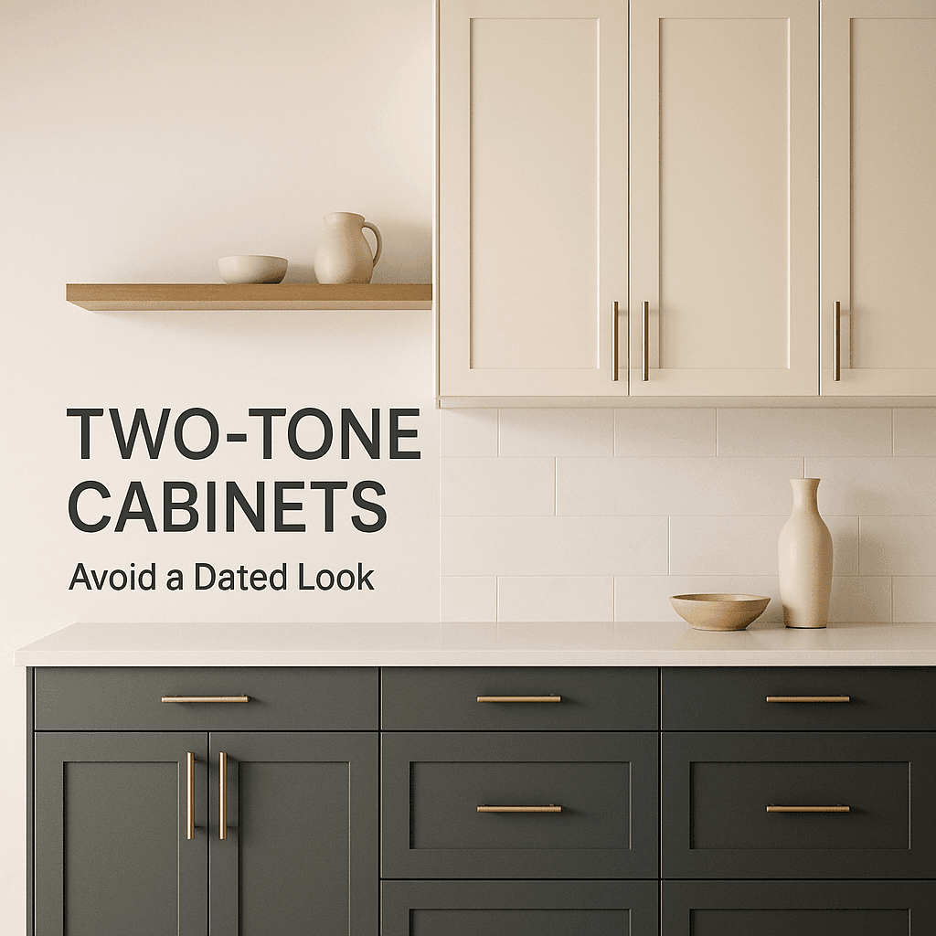
Two tone cabinets had their moment. Then they had another moment. And now a lot of homeowners find themselves in that awkward in-between phase where they appreciate the idea of contrast, but they don’t want their kitchen to resemble a 2016 Pinterest board.
The reality is, when done right, two tone can exude an insanely high end feel. Think designer portfolio high end.
On the flip side, it can also appear as though you haphazardly selected two random cabinet colors from the paint store aisle due to a sudden bout of indecision. There isn’t much middle ground in this scenario.
So let’s delve into how to achieve two tone cabinets in a manner that remains stylish five, ten years down the line. Not overly trendy. Not “safe” in a mundane way either. Just… right.
Why two-tone kitchens start to look dated in the first place
Most “dated” two tone kitchens share a few common problems.
They might have leaned too heavily into a trend color with a short lifespan. They could have employed excessive contrast without a clear plan. Or perhaps they merely replicated a photo without understanding the elements that made it successful (lighting, floors, hardware, counters, proportions).
However, the primary issue often lies here.
Having two strong cabinet colors, coupled with busy countertops, bold backsplash, and statement lights all vying for attention can lead to chaos.
Instead of achieving an aesthetic that feels “layered and intentional,” you end up with a space that screams “a lot is happening in here.”
To avoid this pitfall, remember that two tone needs restraint. Even if your style leans towards boldness. Especially then.
Another important aspect is choosing the right cabinet colors. A common mistake is opting for shades that clash rather than complement each other. For instance, while gray and white kitchens are popular choices, it’s crucial to understand how to choose cabinet colors that work harmoniously together to create a cohesive look.
Start with one cabinet color that is basically timeless
If you want longevity, pick one tone that can carry the kitchen on its own. Even if the other tone changes someday.
Examples that hold up:
- Warm white (not icy bright white)
- Soft greige or putty
- Light oak or medium natural wood
- Deep muted charcoal (not pure black unless the room can support it)
Then the second tone becomes the accent. The supporting actor.
A quick gut check I use: if you removed the second color completely, would the kitchen still look calm and finished. If yes, you are on the right track.
Keep the contrast softer than you think
Hard contrast is where “dated” shows up fast.
White uppers and espresso lowers can work, but it often reads builder grade unless everything else is elevated. Same with stark white plus jet black. It can look graphic in photos, then harsh in real life.
Instead, think in terms of:
- Light and mid tone, not light and extreme dark
- Warm and warm, not warm and cold
- Muted and muted, not muted and saturated
A creamy off white upper with a deep olive lower. A natural wood island with painted perimeter. A soft gray base with slightly warmer uppers. Those combinations tend to age better because they feel more natural.
If you want drama, add it with texture and sheen, not just “dark vs light.”
Use a wood tone as one of the two tones (it solves a lot)
Paint trends come and go. Wood is a constant. Even if the species and stain shift a bit over time, wood still reads “built in” and expensive.
Some of the most timeless two tone kitchens are:
- Painted perimeter cabinets + wood island
- Wood bases + light painted uppers
- Wood tall pantry wall + painted base run
Wood also helps tie the kitchen to other finishes. Floors, beams, furniture, even the view outside in Naples where the light is bright and everything feels a little more coastal.
Just do not pick an orange stain. Please.
Avoid the “split kitchen” look with a unifying element
This is the part most people miss.
Two tone cabinets look dated when they look like two separate kitchens stacked together.
So you need at least one thing that visually unifies both tones.
Good options:
- Same countertop on all surfaces (or at least the same family)
- Same hardware everywhere
- Same door style and same cabinet construction details
- Same toe kick color and trim approach
- A backsplash that bridges both colors (especially if it runs to the ceiling)
If you are mixing door styles, mixing metals, mixing counters, and mixing cabinet colors. You better have a designer. Or you are about to learn an expensive lesson.
Pick the right layout for two-tone. Not every kitchen wants it
Some layouts just do not support two-tone as well.
If you have a lot of tall cabinetry, or your uppers wrap around the whole room, adding a second cabinet color can start to feel chopped up. In those cases, two-tone often works best as:
- A different island color only
- A different pantry wall only
- A different base run only (like the sink wall)
In smaller kitchens, I usually like one dominant tone and a subtle secondary tone. Too much contrast shrinks the room.
In bigger kitchens with an island, the island is the easiest, cleanest place to bring in the second tone without making the whole space feel busy.
Watch your undertones like it is your job
Two colors can look perfect on a paint chip and completely wrong next to your countertop and flooring.
Undertones are the quiet thing that makes a kitchen feel “off” without you knowing why.
A few common issues:
- Cool gray cabinets next to warm beige tile
- Creamy white next to a bright blue white quartz
- Green cabinets next to a backsplash with pink undertones
The fix is not complicated, it just takes discipline. You might find some helpful insights in this article about how to choose paint colors when you’re an overthinker, which could simplify your decision-making process.
Bring everything together in the same light. Not showroom light. Not a phone screen. Your kitchen light.
If you are remodeling in Naples, natural light is a big factor too. Bright Florida sun will exaggerate contrast and can wash out certain colors midday, then make them look deeper at night under warm LEDs.
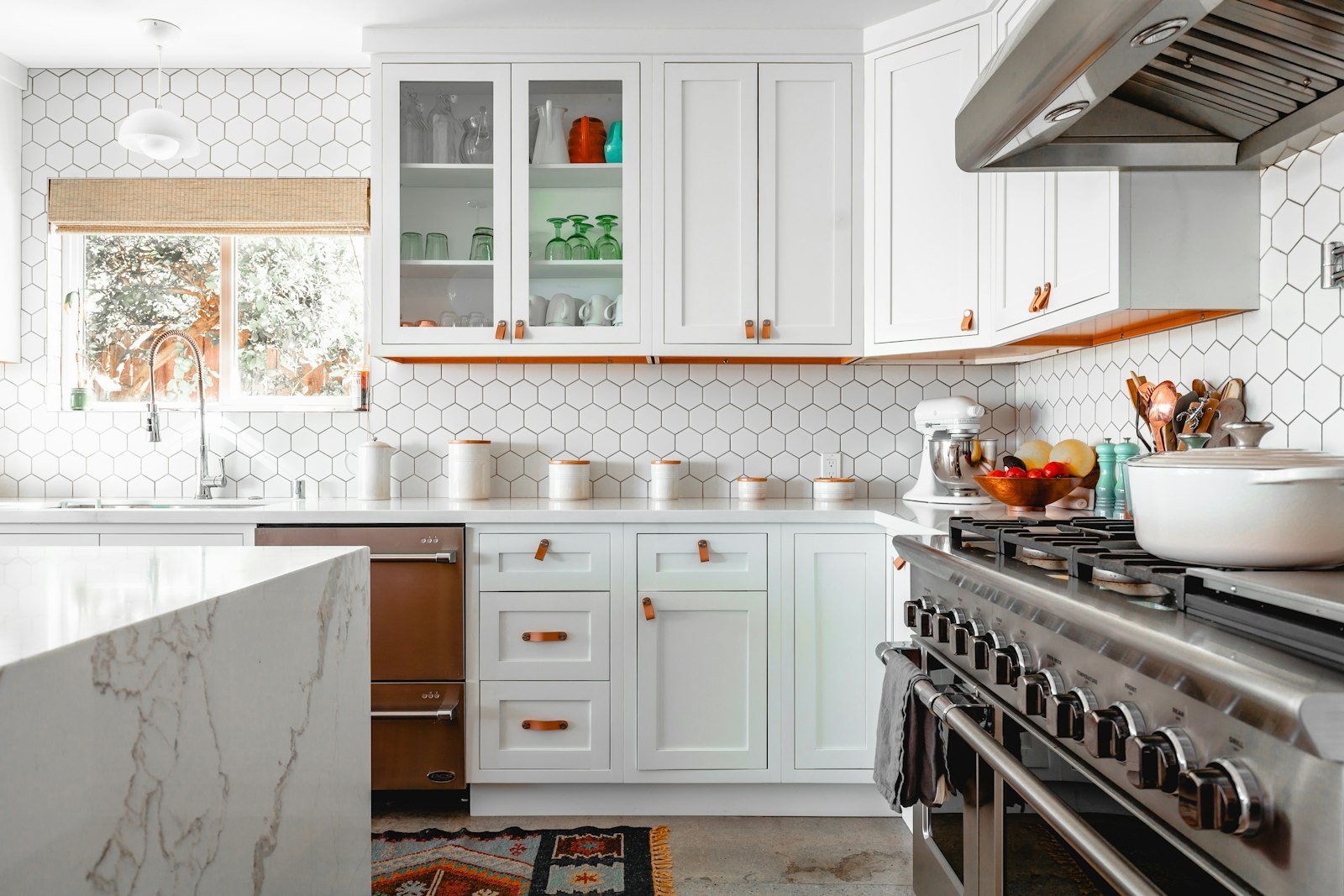
If you work with a local team that does this all the time, it helps. Cutting Edge Builds, for example, is literally built around full kitchen remodel execution and design support, so you are not guessing your way through color decisions in isolation. You can start here if you want to talk through options in your space: https://kitchen-remodeling-naples-fl.com/
Choose a cabinet style that is not overly “of the era”
Another way two tone becomes dated is when the door style screams a specific time.
Ultra ornate raised panel doors plus two tone can feel very early 2000s. Super skinny shaker rails can feel very trend specific too.
If you want longevity, a standard shaker is still the safest bet. But there are also other options that feel current without feeling trendy:
- Slim shaker (not too skinny)
- Simple slab fronts (especially with wood)
- Clean inset styles if you want a more custom look
Whatever you choose, keep it consistent across both colors. Two tone should be about color and material contrast, not a mashup of cabinet identities.
Hardware can either modernize two-tone or date it instantly
Cabinet hardware is small, but it is loud.
If your two tone scheme feels a little too “farmhouse era,” swapping to a cleaner pull can instantly make it feel newer. Same if it feels too stark, you can warm it up with a softer metal.
A few combos that tend to age well:
- Brushed nickel with almost anything (it is boring, but it works)
- Champagne bronze with warm whites, woods, olives
- Matte black in moderation, especially on lighter cabinetry
- Mixed metals if done intentionally (same finish family, repeated in lighting and plumbing)
Try to avoid novelty hardware, overly ornate shapes, and anything that is super trendy on social media right now. Those pieces date fast.
Also, keep your hardware consistent across both cabinet tones. That is one of those unifying elements we talked about.
Keep the countertop quiet if your cabinets are the statement
This is the big balancing act.
Two tone already adds visual movement. So your countertop probably should not be the loudest thing in the room too.
The most timeless pairings I see:
- Simple quartz with gentle veining
- Honed stone looks (less shiny, more natural)
- Warm white quartz with subtle depth
- Soapstone style surfaces with wood accents
If you want a bold countertop, then do a more subtle two tone. Like wood plus soft white. Not two strong paint colors plus dramatic marble veining. Unless you want your kitchen to feel like a showroom. Some people do. Just know what you are choosing.
The backsplash should connect, not compete
If you want to avoid a dated look, skip the tiny mosaic strips and overly busy patterns that were popular years ago.
A backsplash that tends to stay looking clean:
- Simple ceramic subway with a slight handmade look
- Large format tile with minimal grout lines
- Slab backsplash (same as countertop) for a very modern feel
If you are doing a colored lower cabinet, a lighter backsplash that runs to the ceiling can keep the space from feeling chopped in half. It also helps the uppers feel more integrated.
A few two-tone combos that age well (and why)
Not a “rules” list. Just a starting point.
1. Warm white perimeter + natural wood island
Classic. Works in transitional, coastal, modern. The wood breaks up the white without turning into a trend.
2. Soft greige uppers + deeper taupe lowers
Low contrast, very calm. Feels custom, not trendy.
3. Light oak lowers + off white uppers
European leaning, warm, bright. Also great if you want fewer uppers.
4. Off white uppers + muted olive lowers
Color, but grown up color. Olive has more staying power than brighter greens.
5. Charcoal island + light perimeter
Keeps the drama in one zone. Easier to change later too.
What to do if you already have two-tone and it feels dated
You do not necessarily need a full remodel to fix the vibe.
Try this in order:
- Change the hardware (fastest impact)
- Update lighting to something cleaner and more modern
- Repaint one tone to soften contrast or fix undertones
- Swap backsplash if it is the thing dating the room
- Adjust décor so it is not adding more “theme” on top of the cabinets
Sometimes the cabinets are fine. It is everything around them that got stuck in a certain era.
A quick note for Naples homeowners
Naples kitchens often have strong natural light, warm exterior palettes, and a lot of open sightlines into living areas. So two tone has to play nicely with the rest of the home. The floor. The wall color. The trim. Even the outdoor greenery that reflects into the space.
If you are planning a full kitchen renovation and want a two tone look that feels intentional, it helps to work with a remodeling team that can coordinate the whole package, not just install cabinets.
Cutting Edge Builds does high end kitchen remodeling in Naples, FL, and can walk you through cabinet layout, finishes, and the “will this still look good later” part that nobody wants to think about until it is too late. If you want to start with a consult, this is the site: https://kitchen-remodeling-naples-fl.com/
Wrap up
Two tone cabinets are not the problem. Random contrast is.
Pick one timeless base. Keep undertones aligned. Use wood if you can. Let one element lead and the others support. And unify the whole thing with hardware, counters, and a backsplash that does not fight for attention.
Do that, and two tone stops being a trend.
It just becomes your kitchen. Which is kind of the point.
FAQs (Frequently Asked Questions)
Why do two-tone kitchens often start to look dated over time?
Two-tone kitchens can look dated when they lean too heavily into short-lived trend colors, use excessive contrast without a clear plan, or replicate photos without understanding key design elements like lighting, flooring, hardware, and proportions. Additionally, pairing strong cabinet colors with busy countertops, bold backsplashes, and statement lighting can create visual chaos rather than a layered and intentional aesthetic.
What is the best approach to choosing cabinet colors for a timeless two-tone kitchen?
Start with one cabinet color that is basically timeless and can carry the kitchen on its own, such as warm white (not icy bright), soft greige or putty, light to medium natural wood tones, or deep muted charcoal. The second tone should act as an accent or supporting color. A good test is if the kitchen still looks calm and finished without the second color — if so, the palette is on the right track.
How can I avoid harsh contrast in my two-tone kitchen design?
Avoid hard contrasts like stark white paired with jet black or very dark espresso against bright white unless the space supports it with high-end finishes. Instead, opt for softer contrasts such as light and mid-tone combinations, warm tones paired with warm tones, or muted shades combined together. Incorporate drama through texture and sheen rather than just dark versus light color contrasts.
Why is incorporating a wood tone beneficial in two-tone kitchen cabinets?
Wood tones are timeless and help ground the kitchen design because paint trends come and go while wood remains classic. Using wood as one of the two tones—such as a painted perimeter with a wood island or wood bases with painted uppers—adds warmth and ties the kitchen visually to other elements like floors, beams, furniture, and even outdoor views.
How can I prevent my two-tone kitchen from looking like two separate kitchens combined?
To unify two-tone cabinets and avoid a ‘split kitchen’ look, incorporate at least one unifying element across both cabinet colors. This could be using the same countertop material or family on all surfaces, consistent hardware throughout, matching door styles and construction details, uniform toe kick colors and trim approaches, or a backsplash that bridges both colors—especially if it runs up to the ceiling.
What kitchen layouts work best for two-tone cabinetry?
Not every kitchen layout supports two-tone cabinets equally well. Layouts with extensive tall cabinetry or wrap-around uppers may feel visually chopped up when using multiple cabinet colors. In these cases, it’s often best to apply a secondary color selectively—such as only on an island, a pantry wall, or a single base run—to maintain cohesion. Smaller kitchens benefit from one dominant tone with subtle secondary accents to avoid shrinking the space visually.